You could have the best product on the shelf, but if the label doesn’t speak to people, they’ll walk straight past it. That’s just how it works. Customers make snap judgements in seconds, and your label is doing all the talking before anyone even reads the ingredient list or checks the price tag.
Think about the last time you picked up something new at the shops. What caught your eye first? The colour scheme, maybe. The font choice. The way everything just felt put together. That’s custom label printing working its magic. It’s not about slapping a design on a bottle and hoping for the best. It’s about creating something that matches what’s inside, something that feels authentic to your brand and connects with the people you’re trying to reach.
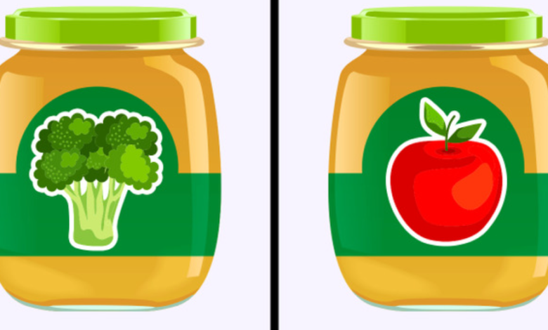
When Your Label Doesn’t Match Your Product (And Everyone Can Tell)
The Disconnect Problem: Small brands pour everything into their products. The recipe gets tweaked dozens of times. Ingredients are sourced carefully. Quality control is taken seriously. Then the label arrives, and it looks like an afterthought. Generic. Safe. Forgettable. That disconnect between what’s inside and what’s outside creates confusion, and confused customers don’t buy. They just move on to the next option.
The Trust Factor: Here’s the uncomfortable bit. If your label looks cheap, people assume what’s inside is cheap too. Fair or not, that’s the reality you’re dealing with. A poorly designed or low quality label sends a message you probably don’t want to send. It undermines all the work that went into creating something special, and that stings.
Getting the Vibe Right Matters More Than You Think
Finding Your Visual Voice: Your brand has a personality, even if you haven’t formally defined it yet. Maybe you’re playful and bold. Perhaps you’re minimalist and sophisticated. Your label needs to speak that same language, or customers get confused about who you actually are. Colour psychology plays a bigger role than most people realise. Warm tones create different feelings than cool ones. Matte finishes say something different than glossy ones.
Material Choices That Make Sense: Paper labels work beautifully for some products but fall apart on others. Polypropylene handles moisture and wear without breaking a sweat. The finish matters too. Some products need that premium gloss to pop on shelves. Others benefit from a textured, tactile feel that invites customers to pick them up and have a closer look. Get this wrong and your beautiful design becomes a soggy mess.
See also: Creating a Healthy and Beautiful Life for the Whole Family
The Real Cost of Getting It Wrong (Spoiler: It’s More Than You Think)
Shelf Life Issues: Labels that peel, fade, or smudge don’t just look bad. They make products unsellable. Imagine a batch of beautiful craft beer with labels that curl up after one day in the fridge. That’s money down the drain, and it’s not just about the cost of reprinting. It’s about the customers who saw that dodgy label and mentally filed your brand under “unprofessional.” That reputation sticks.
Brand Perception Damage: First impressions stick around longer than you’d like. A customer who encounters a subpar label might never give your brand a second chance, even if you fix the problem later. They’ve already decided what you represent, and changing minds is ten times harder than making a good impression the first time. You don’t get a do over with most shoppers.
What Actually Works in Label Design (No Fluff, Just Facts)
Readability Comes First: Fancy fonts look great in design software but fail spectacularly on actual products. Can customers read your product name from three feet away? Can they quickly spot key information like flavour or variant? If they’re squinting or turning the package around multiple times, the design has failed its basic job. Pretty doesn’t matter if nobody can read it.
Balance Between Information and Beauty: Some brands cram every possible detail onto their labels, creating visual chaos. Others go so minimal that customers can’t figure out what they’re looking at. The sweet spot sits somewhere in the middle. Essential information needs to be clear and accessible. Everything else supports the overall design without cluttering it up or confusing people.
What Great Labels Actually Include:
- Product name that’s visible from across the aisle, not tucked away in tiny text
- Key details like ingredients or usage instructions positioned where eyes naturally land
- Brand elements that create instant recognition, even when customers are rushing through their shopping
- Quality materials that survive real world conditions like condensation, handling, and storage
- Finishes that enhance rather than hide the design underneath
Small Details That Create Big Differences
Consistency Across Your Range: When you’re building a product line, labels need to feel like they belong to the same family. Customers should recognise your brand instantly, whether they’re looking at your original product or your newest flavour. This doesn’t mean every label looks identical, but design elements like colour palettes, typography choices, and layout structures should connect them visually. Random designs across your range just confuse people.
Print Quality Matters: There’s a massive difference between labels that look crisp and vibrant and ones that appear dull or pixelated. Print quality affects how colours reproduce, how details render, and how professional the final product appears. Cutting corners here saves pennies but costs pounds in perceived value. Customers notice fuzzy text and washed out colours, even if they don’t consciously realise why something looks off.
Making the Process Less Painful (Because You’ve Got Enough on Your Plate)
Design Flexibility: Some brands know exactly what they want. Others need guidance. The best approach allows for both. Maybe you’ve got print ready artwork that just needs production. Perhaps you need help translating a rough concept into something production ready. Either way, the process shouldn’t feel like pulling teeth or require a design degree to navigate.
Practical Considerations: Labels need to work with your application process, whether that’s hand application for small batches or high speed machinery for larger runs. They need to stick properly to your specific container material. They need to survive your product’s storage conditions, from chilled fridges to warm warehouses. These practical elements matter just as much as the pretty design bits, perhaps even more.
What Happens When Everything Clicks
The Complete Package: Labels that truly fit transform how customers see products. They create shelf appeal that draws people in. They communicate quality and care without saying a word. They make products feel worth the price point, maybe even a premium. When everything aligns, the label becomes part of the product experience rather than just a necessary component slapped on at the last minute.
Building Recognition and Trust: The right label doesn’t just sell one product. It builds recognition across your entire range. Customers start looking for your distinctive style. They trust what they see because the packaging quality matches the product quality they’ve experienced. That’s when labels stop being an expense and start being an investment in long term brand building that actually pays off.
Conclusion
Getting labels right doesn’t have to be complicated or stressful. Start with what makes your product special, then build a label design that reflects that authenticity. Consider the practical realities of where and how your product gets used, because beauty means nothing if it falls apart. Choose materials and finishes that match your brand positioning and actually survive real world conditions. The result? Packaging that looks as good as what’s inside and gives customers confidence in their choice. Request a quote to get started with labels that actually work for your brand.